On this page
I would start with a fine nib for everyday handwriting, move to extra-fine for cramped letters, and choose medium only when your spacing gives the ink room. My product-design priority is legibility at your normal writing speed. A beautifully finished pen is poor value if every lowercase e turns into a dark dot.
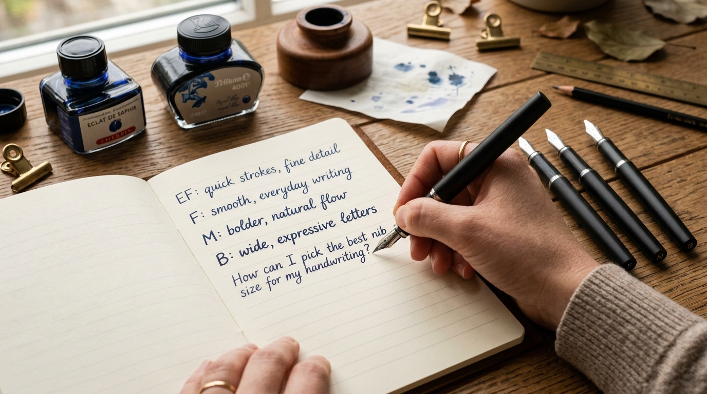
Picking the best nib size means matching three things: the space inside your letters, the paper you actually use, and the amount of ink the pen delivers. This guide gives you a buying order and a simple comparison test, so you can choose without collecting a drawer of almost-right pens.
The Short Answer
Choose the broadest nib that keeps your smallest everyday handwriting clear on your usual paper. Start your comparison with fine. Try extra-fine if loops close up or numbers crowd together; try medium if fine looks spindly and you have generous spacing. Broad and stub nibs make more sense when expressive strokes matter more than fitting text into small boxes.
The letters EF, F, M, and B are relative grades, not universal measurements. Japanese fine and extra-fine nibs often write narrower than Western equivalents, but there is no dependable one-size conversion across every model. Goulet’s nib comparison guide explains this variation. Compare the specific pens you are considering, especially when replacing a favorite.
What Matters Most Before You Buy
Begin with a page you wrote naturally, preferably hurried notes rather than your neatest sample. That page reveals the constraints a new pen must accommodate. Four details deserve more attention than nib material or barrel finish:
- Letter interiors: Look at the openings in e, a, and o, plus the gaps in repeated m strokes. These spaces must survive a slightly heavier line.
- Writing task: Spreadsheet annotations, equations, journal entries, and greeting cards demand different amounts of detail and visual weight.
- Paper and ink: A combination that spreads on office paper can make a fine nib appear broader than expected.
- Hand position: Your grip, pen rotation, pressure, and writing angle affect contact with the page. Test without consciously correcting your normal posture.
My buying verdict: solve the page before upgrading the pen. If your handwriting fits the ruling but the ink spreads, a paper change may help more than a finer nib. If your letters already overlap in pencil, a narrower nib cannot supply the missing spacing.
Match nib width to actual letter size
Measure the body height of a lowercase letter such as x, excluding ascenders and descenders. Notebook ruling is only an indirect clue: two people using a 5 mm grid may write radically different-sized letters. The ranges below are practical starting points for trying pens, not manufacturer specifications or measured line-width guarantees.
| Your normal lowercase body height | First nibs to compare | What decides the winner |
|---|---|---|
| About 2 mm or smaller | Extra-fine and Japanese fine | Open loops and distinct punctuation |
| About 2–3 mm | Fine and medium-fine, where offered | Clear joins at normal speed |
| About 3–4 mm | Fine and medium | Comfort without filling letter interiors |
| Above about 4 mm | Medium and broad | Stroke weight that suits generous spacing |
| Large decorative lettering | Broad and a modest stub | Desired line variation and comfortable pen rotation |
Dense characters need more clearance than their height alone suggests. Closely joined cursive, compact mathematical notation, and characters containing many strokes may push you toward the finer option. Conversely, large open print can accommodate medium even on relatively tight ruling. Judge the most crowded word on the page.
Choose paper based on nib size and ink type
Separate three problems before shopping. Feathering is a fuzzy edge where ink travels into surrounding fibers. Bleed-through is ink penetrating to the reverse. Ghosting is writing visible through the sheet without necessarily penetrating it. A thin sheet can resist bleeding yet still show distracting ghosting.
Paper weight alone does not answer these questions. Surface treatment and absorbency matter, too. For a comparison baseline, Rhodia specifies its 80 g memo-pad paper as fountain-pen friendly. An 80 gsm Rhodia notepad is a useful category to consider; choose the size and ruling you actually need.
As an Amazon Associate, I earn from qualifying purchases.
For fine or extra-fine nibs, prioritize a surface that feels comfortable with light pressure. For medium, broad, or wet-flowing pens, prioritize clean edges and resistance to penetration. More ink can also mean longer drying, so test whether you can turn a page or move your hand across it without smearing.
Start a width comparison with ordinary fountain-pen ink, ideally the supplied cartridge. Then test your intended ink separately. Pale shading inks may become hard to read in very narrow strokes. Shimmer needs a suitable feed and maintenance; a broad label alone does not guarantee reliable particle flow. Waterproofness also does not guarantee resistance to feathering. Never substitute drawing or India ink unless the pen manufacturer explicitly permits it.
Run a five-minute comparison
- Bring your everyday notebook and a sample of any compulsory office paper.
- Compare two neighboring nib grades in the same pen model, using the same ink where possible.
- Write a normal paragraph, your smallest annotation, repeated e and a letters, and numbers such as 0, 6, and 8.
- Check a fresh line for smearing after intervals that match your workflow, such as five, ten, and twenty seconds.
- After drying, inspect the reverse and read the paragraph at normal viewing distance.
A dipped shop sample may write wetter initially than a normally filled pen. Treat it as a useful preview, and ask about the seller’s policy for inked pens before buying. For online comparisons, Goulet’s explanation of its Nib Nook confirms that its samples use the same writer, ink, and paper. That consistency helps isolate differences between nibs.
My Top Picks or Buying Tiers
These tiers rank the decisions worth making first, rather than escalating toward expensive pens. Buy enough control to establish your preferred width, then spend on the body, filling system, and finish you enjoy.
- Tier 1: Fine for a useful baseline. The strongest starting point for compact notes and mixed everyday writing.
- Tier 2: Extra-fine for a demonstrated space problem. Choose it when fine obscures details you need to read.
- Tier 3: Medium for roomier writing. Choose it when your sample remains clear and you prefer a heavier stroke.
- Tier 4: Broad or stub for expression. Buy after confirming that the width suits your page layout and pace.
Keep some budget for cartridges, paper, or a compatible replacement nib. The cheapest complete experiment is often more informative than one premium pen bought on reputation.
Fine and extra-fine: the precision tier
The Pilot Kakuno is a sensible model to investigate for a first comparison. Pilot’s product brochure documents extra-fine, fine, and medium options in the clear version. Browse Pilot Kakuno fine fountain pens, checking the selected nib grade carefully because listings can combine variants.
Choose fine first unless your existing writing demonstrates a need for extra-fine. An ultra-narrow line gives excellent separation, but it can make pale ink less readable. It also makes your choice of paper surface more noticeable. The aim is usable precision throughout a full page, not the smallest possible mark.
Medium: the adjustable everyday tier
A LAMY Safari is worth considering if you want a route between common nib widths without replacing the complete pen. Compare LAMY Safari medium fountain pens, but handle one before committing if possible. Its shaped grip is a meaningful fit decision, particularly if your fingers prefer to rotate the barrel.
My value verdict: a comfortable grip and a replaceable nib are worth more than decorative upgrades while you are learning your preferred width. Check cap fit, secure assembly, and reliable starts as well as the writing sample. A medium nib that suits your letters still disappoints if the pen is awkward through a long meeting.
Broad and stub: the specialist tier
Choose broad when you want a heavier, relatively uniform stroke. Choose a stub when you want contrasting stroke widths from the shape of the tip. A nominal 1.1 mm stub is not equivalent to a round nib drawing a uniform 1.1 mm line. It also asks you to keep its writing edge in consistent contact with the page.
Buy this tier for headings, open handwriting, and deliberate correspondence. If your main task is copying dense information quickly, test it for a full paragraph before deciding that its attractive signature sample justifies the purchase.
Who Each Option Fits Best
Let the least forgiving recurring task break a tie. A pen for both journal pages and tiny appointment boxes should serve those boxes first, unless you are happy carrying a second pen.
- Students and technical note-takers: Compare fine and extra-fine using subscripts, diagrams, and marginal notes.
- Writers with open cursive or larger print: Compare fine and medium across a full page, including your fastest joins.
- Left-handed writers whose hand crosses fresh text: Start with fine and test actual smear time in your usual posture.
- Letter writers and expressive journalers: Compare medium, broad, and stub on the paper you intend to keep using.
Handedness alone does not determine nib size. A left-handed underwriter may comfortably use broad, while a right-handed writer closing a notebook immediately may need a finer, faster-drying combination. Workflow is more informative than the label.
The best starting point for thin paper
For thin, absorbent forms or budget notebook paper, begin with a fine or extra-fine nib with restrained flow. This reduces the ink load, but no nib grade guarantees freedom from bleeding. Try the supplied ink, then a less spreading alternative if necessary, changing one variable at a time.
When you can choose the paper, test a small quantity before buying multiple notebooks. MIDORI describes its MD PAPER as designed to resist smearing and bleed-through, making it another candidate for comparison. Still inspect both sides with your own ink. If the problem is transparency rather than penetration, greater opacity may matter more than a finer nib.
When switching nibs makes sense
You can switch sizes on some fountain pens, but compatibility is model-specific. LAMY’s nib guide describes its replaceable nib system and identifies the LAMY 2000 as an exception. Confirm the exact pen and replacement part before ordering.
A bare nib, a nib-and-feed unit, and a complete grip section are different purchases. Follow the manufacturer’s replacement procedure; do not pull an unfamiliar assembly apart because another brand uses a friction fit. Generic numbers such as #5 or #6 describe physical nib families, not writing width or universal compatibility. Compare replacement cost with the price of another entry-level pen, including any converter you need.
Mistakes I See Beginners Make
Buying from the stamped letter alone. A medium from one range need not match another. Nor does a gel pen’s advertised ball diameter provide a precise fountain-pen conversion. Keep a writing sample from a pen you like, and use it as your reference. Same-model comparisons reduce guesswork.
Confusing narrowness with a defective writing surface. A fine nib can provide pencil-like feedback without being faulty. A sharp catch in one direction, torn fibers, persistent skipping, or needing pressure to start deserves investigation. Clean according to the maker’s instructions and consult the seller before attempting abrasive smoothing.
Changing everything at once
A new nib, new ink, and new notebook may transform the result, but they leave you unable to identify the cause. Establish one baseline, swap one component, and repeat the same sample. If a troublesome line becomes clean on another paper, address that interaction before buying another pen.
Do not press harder to manufacture the missing width. Ordinary nibs are not automatically flexible, and excessive pressure can damage them. Likewise, buying gold does not select the correct stroke for your handwriting. Width, tip geometry, and reliable ink delivery remain separate decisions from material.
Bottom Line
My default recommendation is a fine nib, tested on your everyday paper with ordinary fountain-pen ink. Choose extra-fine when your smallest letters need more clearance. Move to medium when your sample has room and you prefer more visual weight. Reserve broad or stub for a deliberate preference confirmed by a paragraph, not just a flourish.
Before paying, check three things: your smallest letters remain distinct, the reverse of the page is usable for your needs, and the grip stays comfortable at normal speed. When all three pass, you have found a suitable nib size. Spend more only when you can name the additional benefit you want.
If you want the safest recommendation, I would keep the decision boring on purpose: reliable brand, fine or medium nib, straightforward ink, and a body shape you will actually enjoy holding for a page or two. That formula is not flashy, but it is what sets up most new fountain-pen users for a good first month.
Scope, uncertainty & affiliate disclosure
Writing feel is personal. Product details can vary by version, and NibGuide does not imply that every item mentioned was personally purchased or tested.
Some links may be affiliate links. NibGuide may earn a commission at no added cost to you; this does not determine editorial conclusions.
Leave a Comment