On this page
I choose a specialty nib by checking three things first: how small I write, how I hold the pen, and whether I want line variation during ordinary writing or deliberate calligraphy. For a first experiment, my default is a modest stub that leaves the loops in your letters open. A dramatic nib is poor value if you have to enlarge every word or slow down to keep it writing.
My product-designer instinct is to treat the nib, grip, ink, and paper as one working system. The shape stamped on the box tells you less than a paragraph written at your normal speed. Here is how I would narrow the choices before paying for a custom grind or another pen. As an Amazon Associate, I earn from qualifying purchases.
The Short Answer
Choose the smallest specialty nib that produces the effect you want without sacrificing legibility. Start with a stub for everyday thick-and-thin writing, consider a cursive italic for crisper edges, and explore an architect grind for broad horizontal strokes in printing. Choose an oblique only when its slanted tip suits your natural pen rotation. A fude varies width with writing angle; a flexible nib varies width with controlled pressure.
If you write tiny notes, rotate your pen frequently, or press hard, begin with a conventional fine or medium nib while you establish a light, comfortable grip. Specialty does not automatically mean better. You are choosing a different contact shape or mechanical response, and each has a tradeoff. Your best nib size is the one that keeps letters distinct on the paper you actually use.
Why This Matters More Than Most Beginners Think
Handwriting style includes more than cursive versus print. Letter spacing, grip movement, writing speed, and the direction of your strokes determine whether a nib feels natural. A beautiful sample alphabet can hide a mismatch that becomes obvious halfway through a meeting.
- Letter size limits usable width. If the ink fills the opening in an “e” or merges the arches of an “m,” the nib-and-ink combination is too broad for that writing size.
- Tip shape changes the contact area. An edged nib needs a more consistent orientation than a rounded tip. Rolling the barrel may lift part of its writing edge away from the sheet.
- Line variation has different controls. A stub creates contrast through geometry. A fude responds to angle. Flex requires deliberate pressure control; these are different skills.
- Ink delivery changes the result. A broad, wet stroke can spread on absorbent paper or stay wet on resistant paper. Both can make a suitable nib inconvenient.
My buying verdict: pay for reliable contact before dramatic contrast. A pen should start after a normal pause, maintain flow through a sentence, and feel comfortable without a corrective grip. A loose section or slippery grip also matters because it makes consistent nib orientation harder. Decorative trim cannot compensate for those problems.
The reason this topic matters is that nib size quietly changes almost everything a beginner notices first: smoothness, control, ink flow, dry time, and how forgiving the pen feels on ordinary paper. People often assume nib width is just a style preference, but in practice it changes the whole learning curve.
I have also found that beginners blame the pen when the real mismatch is width versus paper or width versus handwriting size. A nib that feels expressive to one person can feel messy, slow-drying, or oddly broad to someone who writes smaller or uses cheap office paper every day.
That is why I treat nib size as a practical fit question, not a collector trivia question. The right width makes the pen easier to trust, which is a big deal when you are still deciding whether fountain pens are enjoyable enough to keep using.
What I Look for First
Before looking at models, write a normal paragraph with your current pen. Include numbers, quick notes, your signature, and words with tight loops such as “minimum” and “coffee.” Use the size and pace you normally need, then check these four details.
- Lowercase body height: measure an “x” or “o,” excluding tall ascenders and descending strokes. Notebook ruling is not letter height.
- Spacing: inspect the white space within letters and between adjacent strokes. Narrow, compressed writing can need a finer nib even when letters are tall.
- Grip and angle: notice how steeply you hold the pen and whether you roll it as you move across the line.
- Pressure and speed: distinguish relaxed writing from pressing to force ink out. Identify whether the nib is for fast notes or slower lettering.
Keep that sample as your baseline. It gives a retailer or nib specialist something concrete to assess and prevents you from judging every purchase against an oversized demonstration. A short side-view video can also show your writing angle more accurately than a guessed number.
What nib size should you use for your letter height?
These are starting points for trials, not a sizing standard. Nib labels and actual ink lines differ across makers, and paper can change the apparent width. The gaps inside your letters decide whether a choice works.
- Below roughly 2 mm: try an extra-fine or fine rounded nib first. Specialty grinds need particular care at this scale; test a narrow sample before commissioning one.
- About 2-3 mm: start with fine or medium. For variation, compare a narrow stub around 0.6-0.8 mm against your baseline.
- About 3-4 mm: medium and modest stubs become easier to accommodate. A 0.8-1.1 mm stub is worth trying if you leave generous spacing.
- Above roughly 4 mm: broader stubs and italics become practical candidates, particularly for headings and open handwriting.
A “1.1 mm” edged nib describes its nominal edge width; it does not produce a 1.1 mm line in every direction. For formal calligraphy, follow your chosen alphabet’s nib-width proportions instead of these everyday-writing ranges.
Match the shape to the effect
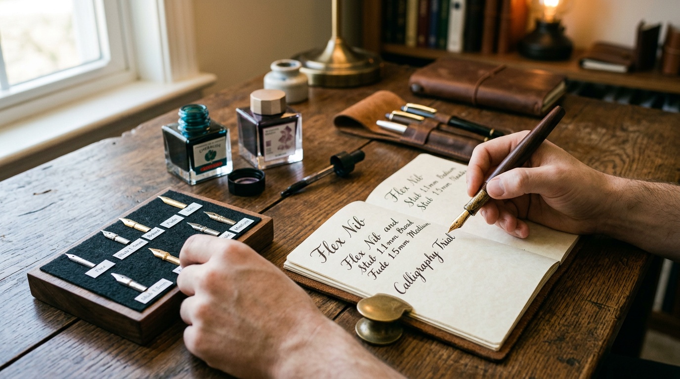
Stub: a forgiving introduction to directional contrast, generally giving broader downstrokes and narrower cross-strokes in a conventional orientation. Cursive italic: a crisper edge with less tolerance for rolling. Sharp italic: suited to deliberate lettering where precise edges matter more than speed. Franklin-Christoph explains this smoothness-versus-definition tradeoff in its specialty nib guide. For ordinary cursive, I would try the stub first.
Architect: reverses the usual stub emphasis, producing broader horizontal strokes and finer verticals at its intended angle. It can complement block printing, but the grind needs to match your writing angle. Oblique: has a slanted writing edge that can accommodate a particular rotated hold. LAMY identifies obliques as suited to an oblique writing position. Slanted handwriting alone is not a reason to buy one.
Fude: uses an upturned tip to change line width with angle. Sailor explains that its Fude de Mannen writes finer upright and broader when lowered. That makes it useful for brushlike marks and sketching, but less predictable for compact notes if your angle shifts unintentionally.
Soft or flexible: responds to pressure, with the amount of usable variation depending on the design. Soft does not promise large flex. Pilot, for example, describes the Falcon as semi-flexible. Do not assume that a gold nib, a springy sensation, or a “soft” label authorizes heavy pressure.
Which nib shape matches your calligraphy style?
For broad-edge italic or blackletter, choose an edged tool and learn a consistent nib angle. For Copperplate or Spencerian, begin with a suitable pointed calligraphy nib and instruction in pressure control. Speedball’s pointed-pen set is designed for Copperplate and Spencerian. An oblique dip-pen holder and an oblique fountain-pen nib are different things.
If broad-edge lettering is the actual goal, browse Pilot Parallel calligraphy pens and choose a width to suit your practice alphabet. Pilot documents their parallel-plate nib construction. A dedicated lettering tool can make more sense than modifying your daily pen. Keep dip-pen ink out of fountain pens unless explicitly labeled fountain-pen safe.
How to Choose Without Overbuying
Buy one controlled experiment. Changing nib, ink, paper, and grip at once makes it difficult to understand why the result improved or deteriorated. Work through this sequence before ordering a second specialty nib.
- Define one job: journal pages, small planner entries, signatures, or calligraphy practice. Choose the most frequent task.
- Set a baseline: use a familiar fountain-pen-safe ink and keep your current pen available for comparison.
- Try one shape: borrow, test in a shop, or buy one compatible replacement. Include return terms and fitting costs in the decision.
- Judge a full page: check comfort, legibility, starts, flow, and drying during normal use before paying for refinement.
For an initial daily-writing experiment, browse stub-nib fountain pens in modest widths, then verify the selected variant and actual nib specification. Search results can mix ordinary and stub versions. Choose the grip that fits your hand; a low price is not good value if the pen makes you fight its orientation.
Run a useful ten-minute comparison
Write a paragraph at normal speed, a row of small numbers, your signature, and several loops. Pause briefly and restart. Repeat with your usual hand position near the bottom of the page, where your wrist angle may change. If possible, compare an ink-filled pen: a dipped sample alone does not establish sustained feed performance.
Record only what helps the decision: which letters close up, whether starts fail, where the nib catches, and whether your hand tires. A little even feedback can be acceptable. Catching sharply in one direction or needing pressure to restart warrants inspection before you blame your handwriting. Do not grind a new nib to fix an unidentified fault.
Choose paper around both nib width and ink
Test your everyday paper alongside one smoother, fountain-pen-friendly reference. Rhodia fountain-pen-friendly notepads are a useful reference category; the maker lists suitable options in its fountain pen paper collection. Use the same ink on both sheets.
On absorbent paper, watch for feathering: fuzzy ink spreading into fibers. On resistant paper, watch drying time and smearing. Broad or wet nibs generally place greater demands on the sheet. Paper weight alone cannot tell you how well its surface handles ink.
Begin with a familiar dye ink without shimmer. Once the nib works reliably, test specialty inks separately. Shimmer particles can complicate flow assessment, and a broad nib alone does not guarantee trouble-free delivery. Waterproof fountain-pen inks can also behave differently from your baseline; follow their cleaning instructions.
For left-handed writing, repeat the test with your actual hand path and check whether your palm crosses wet strokes. A finer line or a different ink may solve smearing more directly than a different grind. Handedness alone does not prescribe an oblique or a special left-handed nib.
Can you switch nib sizes on your fountain pen?
Often, but check the exact model and manufacturer’s instructions first. Some pens use slide-on nibs, others screw-in nib units, and others require specialist servicing. A nib unit includes the nib, feed, and housing; buying a loose nib is not the same purchase.
Match the specified system, housing threads, feed fit, and cap clearance. A “number 6” label is not a universal compatibility guarantee. Franklin-Christoph describes compatibility within its own numbered units in its nib guide, but that does not establish compatibility with every other brand. Flush before changing parts, avoid forcing them, and check warranty implications before a custom grind, which removes material permanently.
Before a custom order, tell the specialist whether the pen will be used posted, with its cap on the back, and send a sample at normal scale. Describe the result you want in plain terms: sharper contrast, a narrower everyday line, or comfortable contact with your rotated grip. Ask for a writing sample with the proposed grind. A name such as “cursive italic” does not communicate every maker’s edge treatment. Agreeing on the intended feel and usable width is more useful than ordering by the grind name alone.
Common Mistakes and Misconceptions
“The best nib size is the one closest to my ballpoint’s number.” Ballpoint tip diameter is not the same as its ink-line width. For a familiar narrow line and straightforward handling, start by comparing rounded fine and medium fountain-pen nibs. Neither recreates a ballpoint’s pressure requirement: Pilot notes that fountain pens need very little writing pressure. Compare written samples, not matching numbers.
“A specialty nib will repair my handwriting.” It can emphasize a rhythm you already have, but spacing and consistent letter forms still do the work. Also avoid treating music nibs as a standardized shape, assuming every gold nib flexes, or buying the widest stub because its demonstration looks impressive. If your normal paragraph becomes harder to read, reduce width or change the paper-and-ink combination before upgrading the pen.
The biggest misconception is that broader always means smoother and therefore better. Broader nibs can feel smoother, but they also dump more ink, show more paper weakness, and create longer dry times. That tradeoff is worth it for some writers and deeply annoying for others.
Another mistake is trusting brand labels as if every fine or medium were standardized. They are not. A Japanese fine can feel closer to a Western extra-fine, and two medium nibs from different makers can still land in very different places on the page. That is why example use cases matter more than marketing words.
I also think people underestimate how much ink choice changes the perception of nib size. A wet ink in a medium nib can behave more broadly than expected, while a drier ink can calm down a pen that initially feels too generous.
Bottom Line
Choose by lowercase height, open letter spaces, natural grip, and the effect you want. A modest stub is a sensible first trial for everyday variation. A cursive italic, architect, oblique, fude, or flexible nib earns its place when its particular behavior matches a specific writing need.
Keep the first purchase small and the comparison consistent. One full page on your real paper tells you more than a beautiful signature. The right specialty nib should give you a result you enjoy at a pace and level of effort you can sustain.
If you want the safest beginner answer, I would still lean fine or medium before anything more extreme. Those widths usually give you enough character to enjoy the pen without forcing you to manage every downside at once.
From there, the smartest upgrade path is not buying more expensive immediately. It is noticing whether you want a cleaner line, more expressive ink behavior, less feedback, or more control on cheap paper. Once you know which direction you want to move, choosing the next nib size becomes dramatically easier.
Scope, uncertainty & affiliate disclosure
Writing feel is personal. Product details can vary by version, and NibGuide does not imply that every item mentioned was personally purchased or tested.
Some links may be affiliate links. NibGuide may earn a commission at no added cost to you; this does not determine editorial conclusions.
Leave a Comment